Blog and News > canddi > New Features and Improved Widgets!
New Features and Improved Widgets!
As you know, we’re always improving and tweaking things (almost always driven by client feedback) and here’s a summary of some new stuff we’ve recently rolled out…

Activities Widget
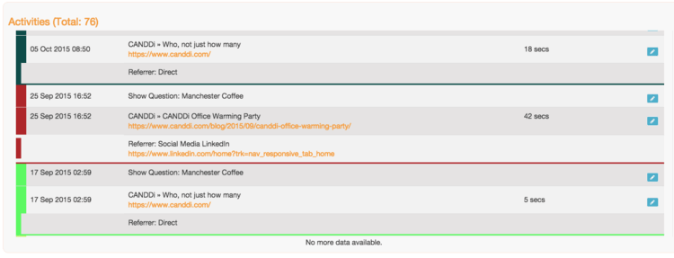
We should send a prize to our quickest new feature spotter Les Carter of Parmley Graham who asked literally minutes after this had been rolled out - “Has someone been getting some new crayons to play with?” :) The answer is yes! And the reason is so it’s much clearer to see what activities happened in each session. In the example below you can see that…
On the 17th September this visitor has a quick look at the home page They then returned 8 days later on the 25th September and read the latest blog This visitor then came back again 10 days later on the 5th October
Before they commit to becoming a client, a prospect will visit your website around 5 times, so having this intel is invaluable for sales teams as they’ll know exactly when their prospects are hot and what they’re interested in. You’ll find the Referrer (how the visitor got to your site) just above the coloured line, making it easier to get a clear picture of their journey.

Another thing you’ll notice is we’ve added some cool icons which will tell you how data which identified the visitor has been obtained as per the following image -

Here are what the icons mean -
 Email has been added
 Company has been identified
 Visitor’s name has been identified
 A tag has been added
IP Widget

We’ve always provided raw data to our clients so you can access all and any information CANDDi holds about your visitors, but to help you make more sense out of this - you’ll now have the data presented in a pie chart making it clearer to see the different locations your visitors are coming from.
Watch our video on the difference between IP tracking and Visitor Analytics for more information on this topic.
Referrer Widget


We’ve also added the pie chart to the Referrers Widget too, this makes it super easy to establish the source of your visitors - what is driving them to your site and bringing them back.
By clicking on the ‘Table View’ option you’ll be able to delve deeper into the details and get more granular information on each specific visit - but the pie chart summarises it nicely. It’s really useful for marketing to be able to see which activities are working best (what should you do more of!) and for sales teams to establish if their prospects are clicking on their 1-2-1 emails.
We’ll be recording some more explainer videos soon, it would be great to get some feedback on what videos would help you in particular.
Stay tuned for more updates soon!
Saadia.